
Workplace Safety Signage: Complete Guide
OSHA standard 1910.145 dictates exact colors, wording, and placement for every accident prevention sign in a general industry workplace.

Workplace Safety Signage: 6 Rules Every Worker and Steward Should Know
OSHA standard 1910.145 dictates exact colors, wording, and placement for every accident prevention sign in a general industry workplace. Workers who know these specifications can file targeted complaints when employers cut corners, and those complaints carry real enforcement weight under Section 11(c) of the OSH Act.
Safety signage in the workplace sits at the intersection of federal regulation, behavioral science, and shop-floor reality. The rules seem simple: post a sign, warn the worker. But ANSI Z535.2-2011 alone contains eight distinct classifications of accident prevention signs, each with specific design and usage requirements. OSHA's 1910.145 regulation adds binding specifications for color, letter contrast, and panel layout. And none of it matters if the sign is mounted behind a forklift rack or printed in a language half the crew can't read.
These six rules cover what the regulations require, where employers consistently fail, and what workers and stewards should document when safety signage at the workplace falls short.
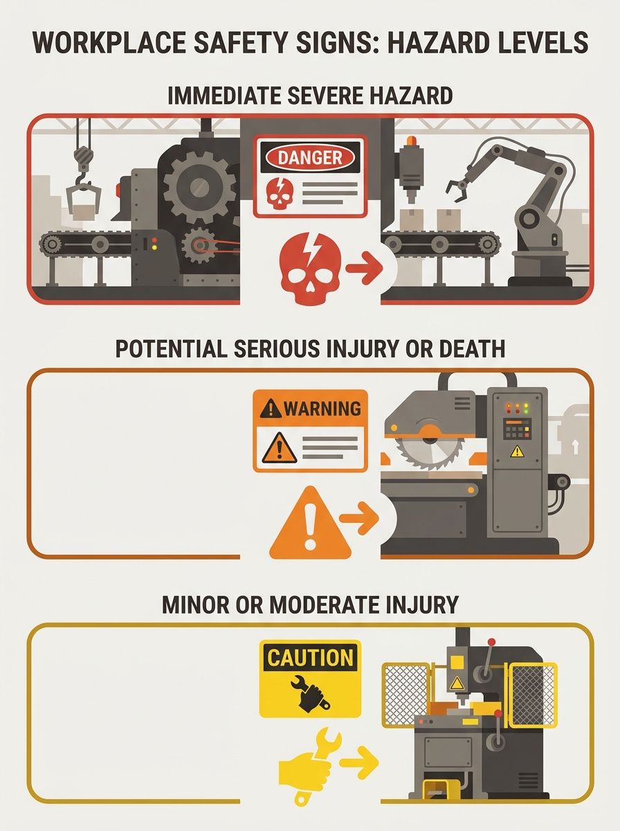
Match the sign classification to the actual hazard level
The single most consequential decision in workplace safety signage is choosing the right signal word. OSHA and ANSI define distinct tiers, and each one communicates a different level of risk. Danger means an immediate threat to life or health. Warning indicates a hazard that could cause death or serious injury. Caution flags situations where moderate or minor injury is possible. Notice conveys information unrelated to personal injury, like property damage or policy reminders.
According to OSHA standard 1910.145, danger signs are reserved exclusively for situations involving an immediate risk, and they "shall be used only when an immediate hazard exists." The DuraLabel design guide reinforces this from the practical side: "Workers need to quickly interpret what a sign is saying, even from a distance or under time pressure. Effective design includes bold headings like 'DANGER' or 'CAUTION,' large fonts, and uncluttered layouts."
Why does misclassification matter? When an employer posts a CAUTION sign near a machine that has caused 3 amputations in 18 months, that downgraded classification becomes evidence of negligence in any subsequent OSHA investigation or workers' compensation claim. One poultry processing facility learned this the hard way when workers discovered that inadequate lockout/tagout signage contributed to preventable injuries on the kill floor.
Follow the color code — every color has legal meaning
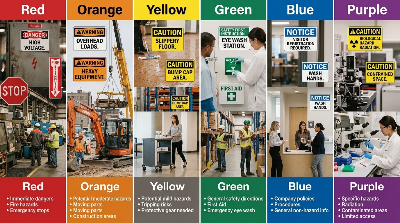
Color isn't decorative on a safety sign. Each color corresponds to a specific hazard category under both OSHA and ANSI standards, and using the wrong one can result in citations. OSHA's 1910.145 specifies that "the standard color of the background shall be yellow; and the panel, black with yellow letters" for caution signs, referencing the opaque glossy samples in ANSI Z53.1-1967 and ANSI Z535.1-2006(R2011). Danger signs must be "red or predominantly red" with contrasting lettering, per OSHA's color standards.
The Texas Department of Insurance summarizes the operational guidance: "Use colors as indicated above: red and orange for warnings, yellow for caution, blue for guidance, and green for safety."
Here's how the full OSHA color system breaks down for signage for safety in the workplace:
Color | Signal Level | Required Use | Common Applications |
|---|---|---|---|
Red | Danger | Immediate life/health threat | Fire equipment, flammable liquids, emergency stops, high voltage |
Orange | Warning | Serious injury possible | Machinery guards, energized equipment, crushing hazards |
Yellow | Caution | Minor/moderate injury possible | Wet floors, trip hazards, low-clearance areas |
Green | Safety Information | Safe conditions/equipment | First aid stations, emergency exits, eyewash locations |
Blue | Notice | Non-injury information | PPE requirements, policy reminders, hygiene instructions |
Purple/Magenta | Radiation | Radioactive materials | Radiation areas, X-ray rooms, nuclear material storage |
Purple and magenta are specifically designated for radiation hazards. As the CloudSDS 2026 safety color guide notes, "the radiation symbol uses magenta, purple, or black on a yellow background," making it one of the few signs that combines two signal colors on a single panel.
OSHA further requires that safety instruction signs use a white background with a green panel and white letters, while any text on the white background itself must be black. These aren't suggestions. They're specifications with the force of federal law under OSHA standard 1910.6, which mandates that accident prevention signs and physical hazard markings meet or exceed the standards cited in subparts 1910.6(e)(59), (66), and (67).
Design every sign for three-second comprehension
A sign that requires careful reading has already failed. Workers encountering safety signages in the workplace are often in motion, operating machinery, or responding to an alarm. The DuraLabel industrial labeling guide specifies that effective design includes "bold headings, large fonts, and uncluttered layouts" because workers need to interpret the message "even from a distance or under time pressure."
Practical design rules that hold up across facilities: limit text to 7 words or fewer after the signal word. Use a pictogram from the ANSI Z535.3 symbol library whenever one exists for the hazard. Set minimum letter height at 1 inch for every 25 feet of expected reading distance. Place the signal word (DANGER, WARNING, CAUTION) at the top of the sign, followed by the specific hazard, then the required action, then the consequence of ignoring the sign.
This four-part structure comes directly from ANSI Z535.2-2011's word message panel format and turns a vague warning into a specific instruction. Compare "CAUTION: Hot Surface" with "CAUTION: Surface exceeds 150°F. Wear thermal gloves. Contact causes burns." The second version takes 2 more seconds to read but eliminates the ambiguity that leads to injuries.
When your workplace handles broader safety program design, sign readability should be tested with actual workers on the floor, not approved by a safety manager in a conference room 200 feet away.
Place signs where workers make decisions
The most common signage failure isn't a missing sign. It's a correctly designed sign mounted in the wrong location. OSHA's maritime standard 1915.16 illustrates the placement principle: a warning sign "need not be posted at an individual tank, compartment or work space within a work area if the entire work area has been tested and certified" and a sign to that effect is "posted conspicuously at each means of access to the work area." The key phrase is means of access, where a worker enters and decides whether to proceed.
Safety signage for workplace hazards should follow what we call the decision-point placement rule: mount the sign at the location where a worker makes the choice that exposes them to the hazard. That's the entrance to a confined space, not the back wall inside it. That's the power switch on a machine, not a bulletin board 40 feet away. That's the threshold of a chemical storage area, not the corridor leading to it.
Floor signs deserve separate attention. Creative Safety Supply's product specifications note that modern safety signage in workplace environments includes "floor and wall signs, labels, banners, and even virtual signs," with floor signs engineered to "endure forklift traffic" and resist chemical exposure, water, and UV degradation. If your hazard is at foot level (a floor drain, a loading dock edge, a cable run), the sign belongs on the floor, not on the wall above it.

Post in every language spoken on the floor
Federal OSHA regulations don't explicitly mandate multilingual safety signs, but the agency's enforcement guidance is clear: if workers can't understand the signs, the signs don't meet the "effective communication" requirement embedded in dozens of OSHA standards. The agency has cited employers under the General Duty Clause (Section 5(a)(1) of the OSH Act) for failing to communicate hazards in languages workers actually speak.
This is where safety signage in the workplace intersects with workforce demographics. A 2024 Bureau of Labor Statistics report found that foreign-born workers made up 18.6% of the U.S. labor force, with that share exceeding 30% in construction, food processing, and agriculture. In those industries, English-only signs leave a third or more of the workforce unprotected.
The fix is straightforward but requires actual effort. Conduct a language audit of your worksite. Identify every language spoken by 5% or more of the crew. Reprint all hazard-level signs (DANGER, WARNING, CAUTION) in each identified language. Use ISO 7010 pictograms alongside text to provide a visual layer that transcends language entirely.
Unions that have tackled communication failures across multilingual workforces know that signage is the baseline, not the ceiling. Training, emergency drills, and safety committee meetings all need the same treatment. But signs are where the documentation trail starts, and where an OSHA inspector looks first.
Audit and replace signs on a fixed schedule
Safety signs degrade. UV exposure fades colors within 18 to 24 months on exterior-mounted signs. Chemical splash obscures text. Forklift impacts crack panels. And when a sign becomes unreadable, it no longer meets OSHA's design specifications for contrast, color accuracy, and legibility. The sign is technically noncompliant from the moment a worker can't read it at the intended distance.
Employers that treat signage as a one-time capital expense rather than a recurring maintenance obligation end up with worksites full of sun-bleached, cracked, or outdated signs that create a false sense of compliance. ANSI Z535 standards recommend formal sign audits at intervals no greater than 6 months for industrial environments and 12 months for office or low-hazard settings.
An effective audit checks 5 things at each sign location: is the sign still physically intact, is the color within recognizable range of the OSHA specification, is the text legible at the rated distance, does the hazard described still match current conditions, and has any equipment or process change created a new hazard that lacks signage entirely? That fifth item catches the most dangerous gaps. A process line that added a new chemical 8 months ago but never got a corresponding GHS-compliant sign isn't displaying an outdated sign. It's displaying no sign at all.
Workers covered by collective bargaining agreements should push for sign audit language in the health and safety article of their contract. Specifying audit frequency, worker participation in walkthroughs, and a timeline for replacement (14 calendar days from identification is a reasonable standard) turns signage maintenance from a management afterthought into an enforceable obligation.
When These Rules Break Down
These six rules cover the overwhelming majority of general industry workplaces. They don't cover every situation. Construction sites governed by 29 CFR 1926 have additional signage requirements for excavations, scaffolding, and crane operations that go beyond 1910.145. Maritime workplaces follow 29 CFR 1915 and 1917, which include the work-area certification provisions discussed above. Agriculture has its own standards under 29 CFR 1928, where pesticide warning signs follow EPA Worker Protection Standard timelines rather than OSHA color codes.
Temporary and multi-employer worksites add another layer of complexity. When 4 different contractors share a floor and each one brings its own signage standards, the "controlling employer" doctrine makes the general contractor responsible for overall hazard communication. Workers on those sites should know which employer has signage authority and direct complaints accordingly.
And the shift toward "virtual signs" projected onto floors or walls by laser or LED systems raises questions that current OSHA standards don't fully answer. Creative Safety Supply already markets these products for warehouse environments. OSHA hasn't issued specific guidance on whether projected signage meets the material durability requirements in 1910.145. Until it does, treat virtual signs as supplementary, not primary.
The core principle holds across every exception: a safety sign exists to change a worker's behavior at the exact moment they encounter a hazard. Every rule above serves that single function. When you find a sign that doesn't change behavior, document why, report it, and push for the fix. The regulations give you the standing to demand it. The union gives you the collective power to enforce it.
The Union Edge Staff
Related Articles

Essential Workplace Safety: 10 Topics Every Business Needs
Fall protection has topped OSHA's most-cited violations list for over a decade, and the same ten health and safety topics in the workplace appear in the agency's enforcement data year after year, accounting for the bulk of preventable worker injuries and deaths across American industries.

Safety Topics for Workplace: 10 Must-Know Guidelines
Slips, trips, and falls account for 25% of all injury claims filed each year and cost employers more than $10.5 billion annually. This guide covers ten critical safety topics for the workplace, each with a concrete action you can take and a way to verify you've done it right.

10 Essential Safety Suggestions for Modern Workplaces
Workplace safety suggestions fall into three categories: compliance-only programs that meet OSHA's legal minimum, technology-driven systems that use data and wearables to track hazards, and worker-led safety committees where employees identify and fix risks themselves.
Also in the paper